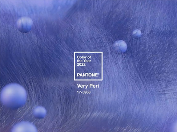
"Very Peri," a dynamic periwinkle blue hue with an intense violet-red undertone, is Pantone's Color of the Year for 2022.

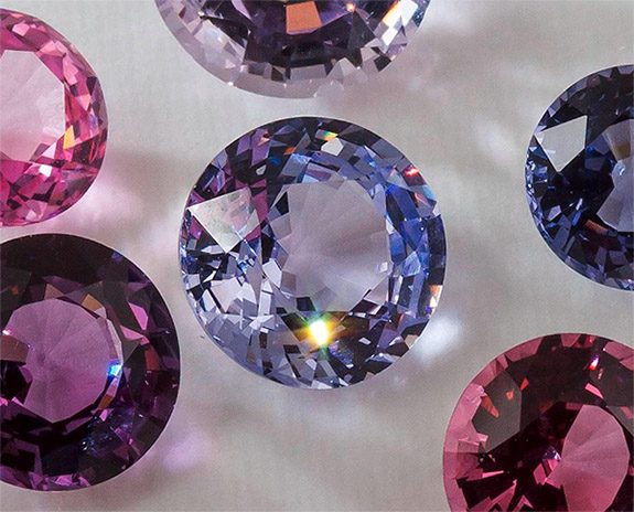
Blending the faithfulness and constancy of blue with the energy and excitement of red, this happiest and warmest of all the blue hues introduces an empowering mix of newness, according to The Pantone Color Institute. Consumers who embrace Very Peri fashion items will be accessorizing with fine jewelry featuring amethyst, tanzanite, iolite, spinel or violet sapphire.

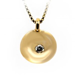
The spinels shown, above, were sourced in Vietnam and are now part of the Smithsonian's National Gem Collection.
The selection of PANTONE 17-3938 Very Peri marks the first time the international color authority has cooked up a brand new color and then instantly designated it as the Color of the Year.
According to Pantone, Very Peri displays a carefree confidence and a daring curiosity that animates our creative spirit. The inquisitive and intriguing color helps us to embrace this altered landscape of possibilities, opening us up to a new vision as we rewrite our lives.
“As we move into a world of unprecedented change, the selection of PANTONE 17-3938 Very Peri brings a novel perspective and vision of the trusted and beloved blue color family,” noted Leatrice Eiseman, Executive Director, Pantone Color Institute. “Encompassing the qualities of the blues, yet at the same time possessing a violet-red undertone, Very Peri displays a spritely, joyous attitude and dynamic presence that encourages courageous creativity and imaginative expression.”

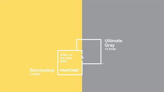
The confident and joyful "Veri Peri" of 2022 is a far cry from Pantone's Colors of the Year for 2021 — “Ultimate Grey” and “Illuminating” yellow. In the midst of a global pandemic, the experts at Pantone were torn between a grey color that symbolized rock solid fortitude and a yellow color that represented sunny optimism. In the end, they chose both.
Now, as the world is emerging from an intense period of isolation, our notions and standards are changing, Pantone explained.
“The Pantone Color of the Year reflects what is taking place in our global culture, expressing what people are looking for that color can hope to answer,” added Laurie Pressman, Vice President of the Pantone Color Institute.
Each year since 2000, the color experts at Pantone have picked a color that reflects the current cultural climate. Typically, Pantone’s selection influences product development and purchasing decisions in multiple industries, including fashion, home furnishings and industrial design, as well as product packaging and graphic design.

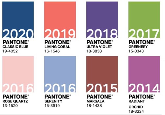
Here are the Pantone Colors of the Year dating back to 2014…
PANTONE 19-4052 Classic Blue (2020)
PANTONE 16-1546 Living Coral (2019)
PANTONE 18-3838 Ultra Violet (2018)
PANTONE 15-0343 Greenery (2017)
PANTONE 13-1520 Rose Quartz (2016)
PANTONE 15-3919 Serenity (2016)
PANTONE 18-1438 Marsala (2015)
PANTONE 18-3224 Radiant Orchid (2014)
Credits: Screen capture, color swatches via Pantone.com. Spinel photo by Ken Larsen / Smithsonian.
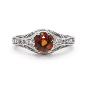 Spessartite Garnet Ring
1 × $2,470.00
Spessartite Garnet Ring
1 × $2,470.00